From docker-compose to diagram: the story of compose-diagrams
A problem everyone has seen
Open a technical article about a distributed system and look for the architecture diagram. It is almost always there: boxes, arrows, a cylinder for the database. Usually the author drew the diagram by hand, using a general-purpose drawing tool and a notation that only the author understands.
The tool I present here grew out of a discussion in one of my PhD courses. Our starting point was that practitioners tend to use informal diagrams to represent the components of a system. Notations such as UML show up mostly in academic work or in documents that formalize software models, and C4, which is less formal, has been gaining ground among practitioners. In everyday work, though, the ad-hoc diagram dominates.
Ad-hoc diagrams have two flaws. They follow no rules, so each reader has to guess what an arrow means. And they age: the system changes, the drawing stays, and after a while the two tell different stories.
The idea: the system already describes itself
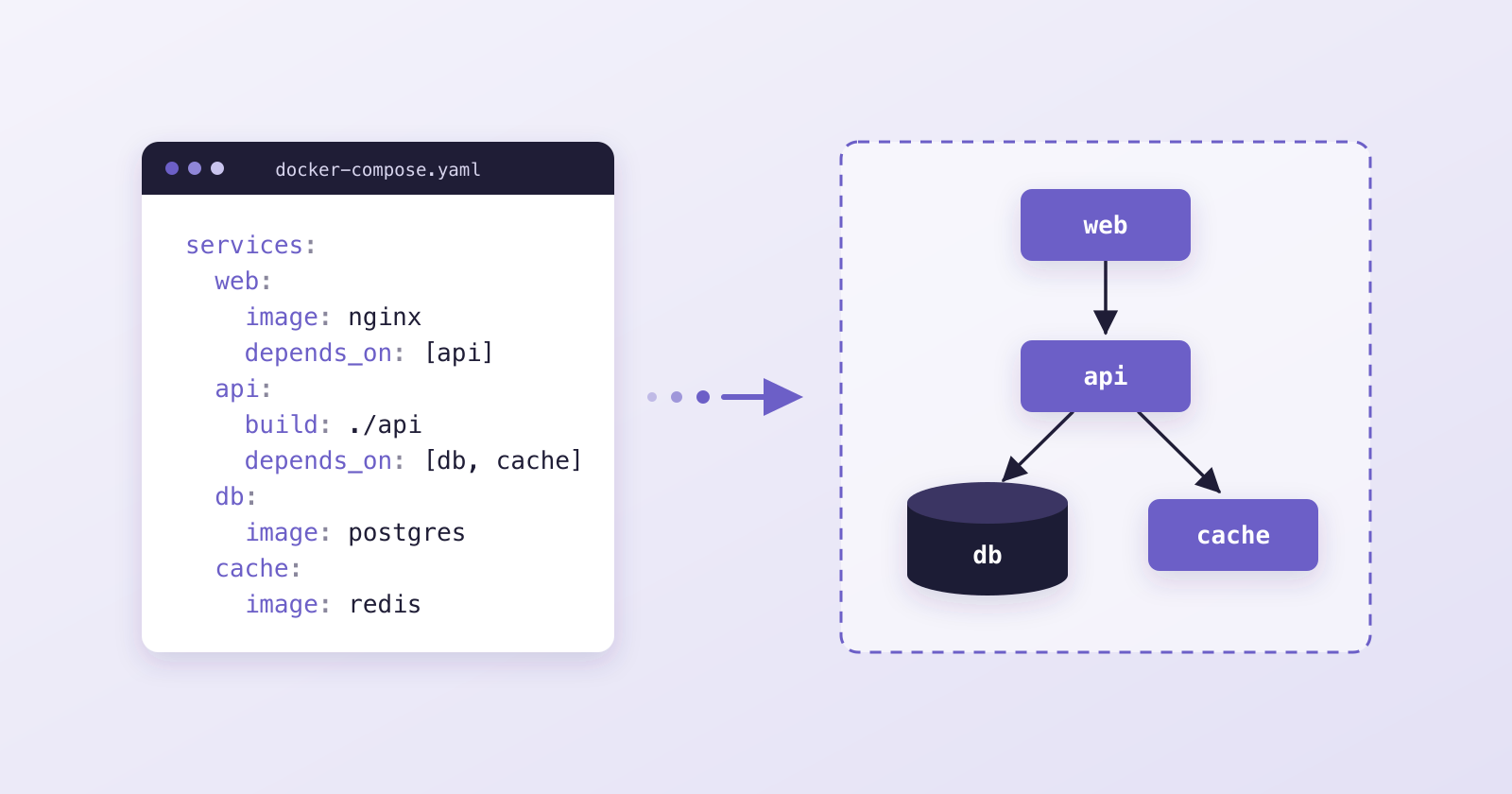
The way out we arrived at in that discussion was to stop drawing and start generating. A modern distributed system already ships artifacts that describe its deployment. A docker-compose.yaml file says which services exist, which image each one runs, which ports it publishes, what it depends on and where it stores data.
We call these artifacts system descriptors; they bring the system up and stay fresh, so someone notices if they go stale.
A diagram generated from the descriptor inherits that property. Change the file and the diagram changes with it. Consistency no longer depends on the discipline of whoever draws.
From prototype to paper
Initially, we started the project in June 2020. Moreover, we developed a Python prototype named DAD to show we could produce a diagram from docker-compose. It read the file and drew the services, dependencies and volumes with Diagrams, a library that creates diagrams from code. We demonstrated that it could be done, and that was only the first step. We cared about a different question: whether the diagram generated from the system descriptor is more consistent with the system than an ad-hoc diagram.
In 2021 that question became a paper. We published Towards improving architectural diagram consistency using system descriptors at the 29th IEEE/ACM International Conference on Program Comprehension (ICPC 2021). A preprint is available on arXiv.
The paper proposes hypotheses: a diagram from a valid descriptor is consistent, and a descriptor from a diagram is consistent. In the case study, we wrote a descriptor based on Netflix’s deployment diagram and generated a new diagram from it. We could represent every element of the docker-compose file, and the generated diagram showed none of the original’s inconsistencies.
In 2022 we followed up with An approach to build consistent software architecture diagrams using DevOps system descriptors, published in the Companion Proceedings of the ACM/IEEE 25th International Conference on Model Driven Engineering Languages and Systems (MODELS ’22). That second paper offers guidelines for creating diagrams, a taxonomy of the concepts found in system descriptors, and a process for turning descriptors into diagrams, applied to a news-feed system described in Docker Compose. Its conclusion was cautious: for now, descriptors lead to consistent diagrams only to a limited extent, but the approach is promising. It is also on arXiv.
During that period the research turned to a survey of software engineering practitioners. We showed them a few architecture diagrams and asked about the strengths and weaknesses of the ones generated from descriptors. The code, however, sat still: the last commit of that phase dates from May 2021.
Picking it up again: compose-diagrams
In 2026 I picked the project up again, now under the name compose-diagrams. The prototype had its input file hard-coded; the current version is a tool anyone can install and use. Three things are new.
Command line. One command takes the docker-compose file and returns the image as PNG, SVG, PDF or JPG, in the layout direction you choose.
Local web interface. A page with the file on the left and the diagram on the right, redrawn as you edit. It runs on your machine, and the file is not sent anywhere.
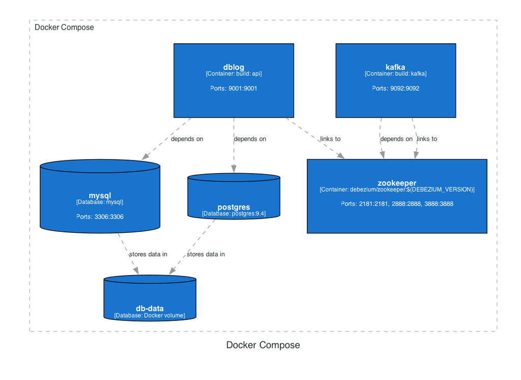
C4 style. This is the addition closest to the original discussion. Besides the diagram with icons, the tool generates the C4 container view: the Compose project is the system boundary, each service is a container with its image and ports, databases and named volumes are data stores, and dependencies become labelled relationships. Readers get a notation they already know instead of one more ad-hoc drawing.
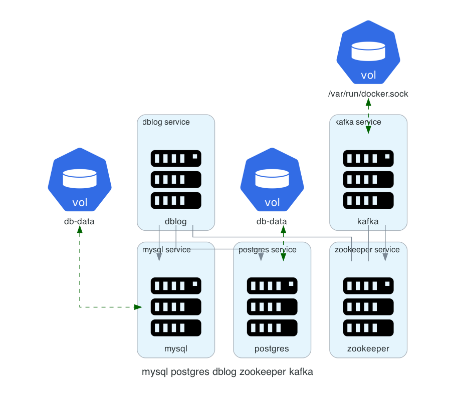
The two figures below come from the same file, an example with MySQL, PostgreSQL, Kafka and Zookeeper.
Figure 1. Ad-hoc style: services, dependencies and volumes drawn with icons
Try it
You need Python 3.9 or later and Graphviz installed. Then:
git clone https://github.com/jalvesnicacio/compose-diagrams.git
cd compose-diagrams
python3 -m venv .venv
source .venv/bin/activate
pip install .
To generate a diagram from a file, in the ad-hoc style and in the C4 style:
compose-diagrams docker-compose.yaml
compose-diagrams docker-compose.yaml -s c4 -o architecture.svg
To open the web interface in your browser:
compose-diagrams --webThe repository includes sample files in the docker-compose-files folder, in case you want to try it before using one of your own.
If you would rather not install Python or Graphviz, you can use Docker. From the project folder, build the image and start the web interface, which is served at http://localhost:8000:
docker build -t compose-diagrams .
docker run --rm -p 8000:8000 compose-diagrams
The same image works as the command line. Mount the folder that holds your file, and the diagram is written there:
docker run --rm -v "$PWD":/work compose-diagrams docker-compose.yaml -o diagram.pngWhat comes next
The project is open source and far from finished. What is missing is tracked as issues on GitHub, and some of them are good starting points for anyone who wants to contribute:
- large files still produce diagrams that are far too wide;
- the ad-hoc style uses the same server icon for everything, when it could show the MySQL, Redis or Kafka one;
- the networks in the docker-compose file are read but not drawn yet;
- the package is not on PyPI and the Docker image is not in a registry, so installing still means cloning the repository.
There are also open questions about C4. A docker-compose file does not say who uses the system or which external systems it talks to, and those are central pieces of a C4 diagram. How to represent them without making information up is a discussion I would like to have with people who use the notation every day.
On the very day the issues were opened, two outside contributions arrived, from two different people. The first came minutes after the issue it fixes, and both are already part of the project. If outdated diagrams bother you too, the repository is open.